Time for the GUI to change.

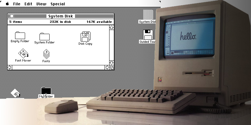
Over a decade ago, I felt it was time to change the way we interface with computers. The GUI (graphical user interface) on pcs had not fundementally changed since the mid-eighties. Although revolutionary at the time, I never felt a mouse was necessarily the best way to interface. You hold what amounts to a bar of soap and drag it around on a different plain, to line up a small pointer moving in a different place. This may seem natural now, but you need only look to a child or an older person trying to come to grasp with it, to see it is really not intuitive.
Their seems to be a riding opinion out there, that in order to be a real computer, it has to be complex, have lots of settings, features and configurations to play with. I disagree with that notion. The OS, in theory, should be as transparent as possible. It is merely the vessel to do the real work in the applications or to access information. The more it gets in the way, the more it is failing us. Since the eighties, the way we navigate this has not changed. You have application icons, folders, files and trash cans. This anology was representative of a paper office and things people were familar before computers ruled the workplace. Today’s younger generation are becoming less familar with these referances of the past. They most likely learn about them first from a computer. Look at how your own brain works. How hard would it be if all of your memories were stored in folders in a filing cabinet? How long would it take to find those memories? This symbolism no longer applies to a computer, in which a simple search brings up everything.
Except in a ways to incorporate new technology, the GUI has made no big changes except to be increasingly complex and create new ways to distract you from the task at hand. Apple has failed at making significant changes on the core consumer GUI, since they first brought it to the masses 1984. Microsoft had an inkling to change this, by investing lots of resources in the tablet touch screen market, but they failed to change their OS to accommodate it. Trying to use a pen stylus to find the tiny x in the top corner to close a window, is a failure. They failed to bring benefits of a touch interface by not starting from scratch, and rethink the archaic way we navigate. Now with Surface, Microsoft is getting somewhere. But this seems still an experiment, that is massively expensive and not built for the everyday user.
Thankfully, over the last few years real change has come from the mobile phone space and the glory of multi-touch. Finally some real evolution can happen in the pc space, if they can learn from it. Maybe someday in a old-timey voice we may say, ” I remember when we dragged around something called a mouse and tippity-tapped on a keyboard! ” or “We use to work in these small boxes, called cubicles, and sit behind a desk all day.. and we liked it because that how things were!”


